Freespoke
Freespoke
How a research-driven redesign improved engagement by 45% and reduced bounce rate by 58%.
How a research-driven redesign improved engagement by 45% and reduced bounce rate by 58%.

Role
Product Design
UX Research
company
Freespoke
Stakeholders
CEO & COO
Engineering
Product
Analytics
Marketing
Revenue
Platforms
iOS
Android
Tools
UserInterviews.com
HotJar
Mailchimp
Figma
PROJECT SUMMARY
PROJECT SUMMARY
Context
Context
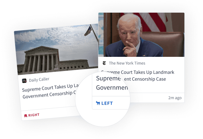
Freespoke is a privacy-first search engine and news aggregator that helps users understand media bias by labeling sources across the political spectrum.
Over time, the product expanded to include an Election Portal and ShopUSA, an American shopping marketplace. While each feature aligned with the company's mission, they significantly increased the product's surface area and complexity.


Search

Election Portal
News

ShopUSA
Search
News
Election Portal
ShopUSA
The Problem
The Problem
After launching a redesigned mobile app, previously dormant issues surfaced. As Freespoke’s scope had expanded over time, the redesign amplified existing complexity and made the product’s core value harder to access.
This resulted in three key issues:
After launching a redesigned mobile app, previously dormant issues surfaced. As Freespoke’s scope had expanded over time, the redesign amplified existing complexity and made the product’s core value harder to access.
This resulted in three key issues:
1
Loyal users experienced new friction
Loyal users experienced new friction
Long-time users found the app harder to navigate, reducing efficiency and disrupting familiar workflows.
Long-time users found the app harder to navigate, reducing efficiency and disrupting familiar workflows.
2
The homepage lost clarity
The homepage lost clarity
The redesign drifted from engagement-driving patterns, making Freespoke’s purpose less immediately clear.
The redesign drifted from engagement-driving patterns, making Freespoke’s purpose less immediately clear.
3
New users didn't return
New users didn't return
Strong downloads didn’t translate to retention, revealing a gap between expectations and in-app experience.
Strong downloads didn’t translate to retention, revealing a gap between expectations and in-app experience.
The Solution
Remove superfluous features. Highlight search feature while giving users what they want—the news!
Home Page
Home Page
Before
Before
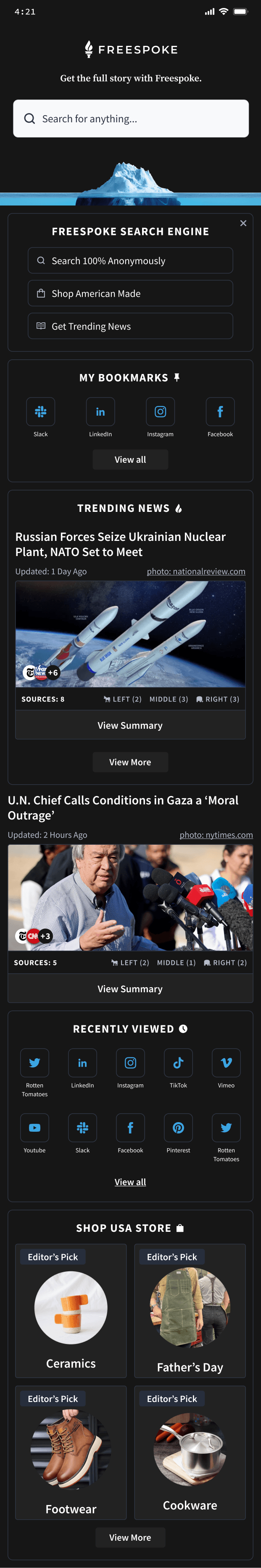
Painpoints
Painpoints
2 search bars present (home page & nav bar)
2 search bars present (home page & nav bar)
Redundant pathways to features
Redundant pathways to features
Hierarchy of Bookmarks
Hierarchy of Bookmarks
Limited News coverage
Limited News coverage
Hierarchy of Recently Viewed
Hierarchy of Recently Viewed
Confusion what ShopUSA is
Confusion what ShopUSA is
After
After
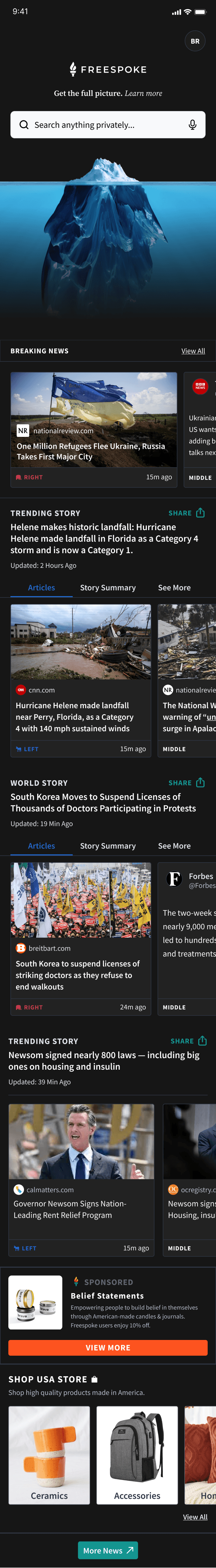
Solutions
Solutions
Combine search and endless Newsfeed scroll to streamline features
Combine search and endless Newsfeed scroll to streamline features
Add reader mode for integrated accessibility
Add reader mode for integrated accessibility
Pull out share button to propel growth
Pull out share button to propel growth
Abbreviated URL to clean up UI
Abbreviated URL to clean up UI
Home Page - Nav Bar
Home Page - Nav Bar
Before
Before

Painpoints
Painpoints
News + Election tabs turn into navigation arrows
News + Election tabs turn into navigation arrows
Android UI elements across all OS and devices
Android UI elements across all OS and devices
Long, messy URL
Long, messy URL
After
After

Solutions
Solutions
Add reader mode for integrated accessibility
Add reader mode for integrated accessibility
Pull out share button to propel growth
Pull out share button to propel growth
Abbreviated URL to clean up UI
Abbreviated URL to clean up UI
Web Page - Nav Bar
Web Page - Nav Bar
Before
Before

Painpoints
Painpoints
News + Election tabs turn into navigation arrows
News + Election tabs turn into navigation arrows
Android UI elements across all OS and devices
Android UI elements across all OS and devices
Long, messy URL
Long, messy URL
After
After

Solutions
Solutions
Add reader mode for integrated accessibility
Add reader mode for integrated accessibility
Pull out share button to propel growth
Pull out share button to propel growth
Abbreviated URL to clean up UI
Abbreviated URL to clean up UI
My Impact
My Impact

2.1x
2.1x
in app home page searches within the first 4 months
in app home page searches within the first 4 months
home page searches within 4 months

+93%
+93%
actions per visit on app
actions per visit on app
actions per visit

-58%
-58%
in new user bounce rate
in new user bounce rate
in new user bounce rate

+45%
+45%
in 1st time visit duration
in 1st time visit duration
in 1st time visit duration
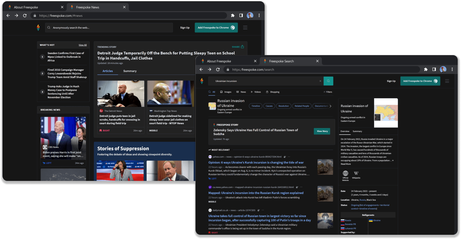
Product Ecosystem
Product Ecosystem
Available across web and mobile platforms, Freespoke's mobile app presented unique design challenges with its hybrid architecture of native screens and web wrapper functionality. I designed the complete experience for both iOS and Android platforms, with iOS screens shown throughout this case study.
Available across web and mobile platforms, Freespoke's mobile app presented unique design challenges with its hybrid architecture of native screens and web wrapper functionality. I designed the complete experience for both iOS and Android platforms, with iOS screens shown throughout this case study.

Synthesis
Synthesis
Translating User Insights into Actionable Design Goals
Translating User Insights into Actionable Design Goals
Research question
Research question
Do users understand Freespoke is both a search engine AND browser?
Do users understand Freespoke is both a search engine AND browser?
User Insight
User Insight
Users only understand it's a search engine
Users only understand it's a search engine
Takeaway
Takeaway
It ultimately only matters that users understand it is a search engine
It ultimately only matters that users understand it is a search engine
Research question
Research question
What are users getting on the Home that they’re not getting on the News tab?
What are users getting on the Home that they’re not getting on the News tab?
User Insight
User Insight
Users expect the home page to be more customizable and the News tab unfiltered news
Users expect the home page to be more customizable and the News tab unfiltered news
Takeaway
Takeaway
Current lack of resources; add to Roadmap for future
Current lack of resources; add to Roadmap for future
To be continued…
To be continued…
More content coming soon :)
More content coming soon :)
More content coming soon :)